Every brand, especially those starting out, must have a Facebook ad strategy that goes beyond budget spend. A sure tell sign that a brand is on the right track is if its strategy is contingent on leveraging optimized ads to the right audience. In doing so, brands can both make the most of their PPC budget while better promoting their brand.
Our experts will be the first to agree that the former is easier said than done. Luckily, they’ve delved deep into their experiences and laid out what they believe to be the key elements needed to create a successful ad.
The following article is broken into two parts:
1. How to design a creative ad for better optimization
2. How to manage ads to sustain the highest level of optimization
How to Design a Creative Facebook Ad for Better Optimization
Facebook allows for many variations of ad formats and placements to meet any type of marketing goal. The following 6 tips uncover the design specifications and technical requirements recommended for an engaging ad.
1. Diversifying Formats and Creative Types
Static Image
The more basic yet most commonly used ad format is the static image. With a standalone image, marketers can use this format in multiple different ad types, placements, and ratios. Regardless of a brand’s funnel stage, static images are easy to make and can effectively show off a product so long as they’re high quality – to make them stand out – and respect the appropriate aspect ratios.
Certain limitations worth noting include the attention span of a user on a feed; it may last up to 8 seconds – if you’re lucky! Used properly, marketers can use static images to catch their attention with an impactful scroll stopper.
Video
Videos can be a great tool to communicate a story and show more of a brand’s personality. However, having a brand identifier within the first 2.5 seconds of a video is crucial as user attention span is imminent. That way, even if the user quickly ignores the ad, they’ll at least have had a glimpse of the brand’s identity within the first frame, maintaining the core brand idea.
Pro tip: Design for no sound. Should an ad need to communicate a message but its audience does not have the means to listen to it, it becomes crucial not to let the marketer’s efforts go to waste.
Finally, go on the offensive by stating a clear call-to-action so users automatically know which steps to take next.
GIFs and Animations
Gifs and animations are another great way to catch the eye of an audience without having to watch an entire video. This type of video format is effective as it can showcase multiple products at once.
GIFs and animations are precious tools often used by brands as they can promptly demonstrate points of differentiation as well as product variety.
Carousels
Carousels are a great tool to:
· Educate audiences about a brand and its processes;
· Display the extent of a brand’s experience/service/product;
· Maintain a direct in-platform interaction while a user is swiping.
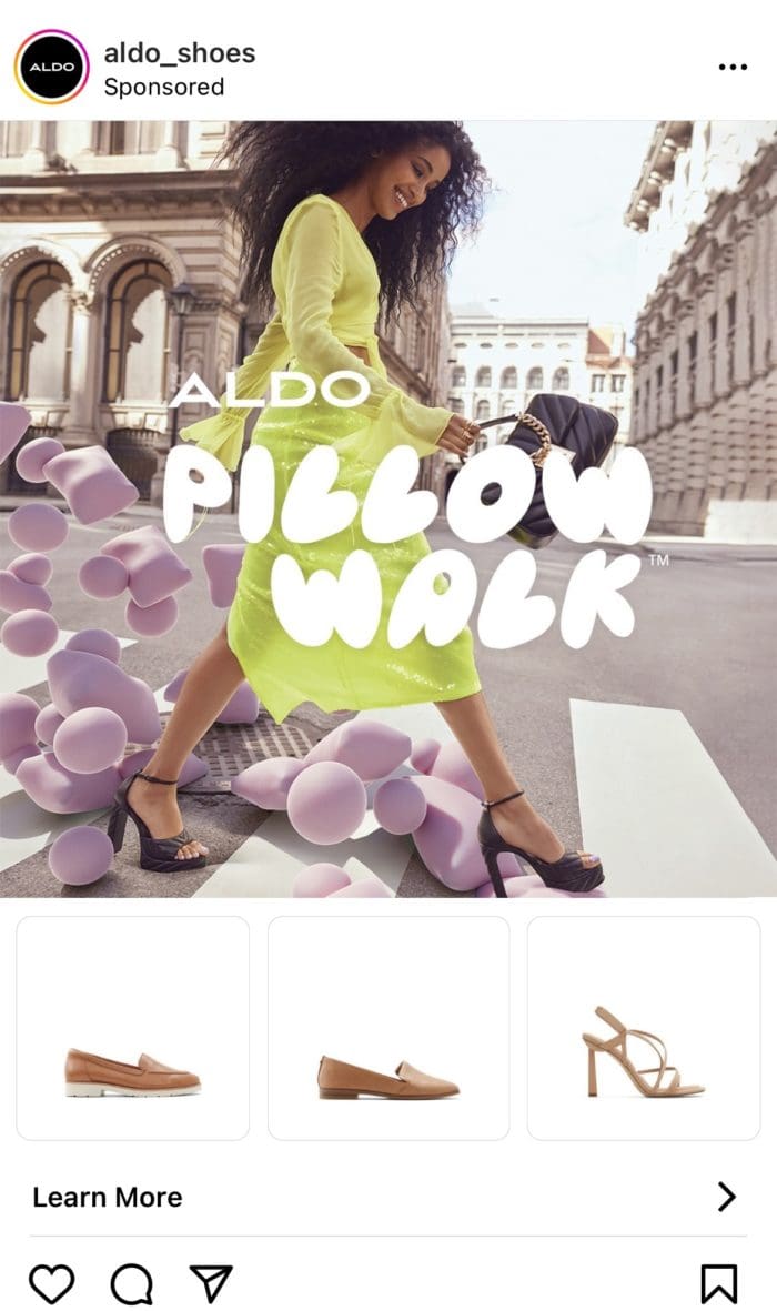
As for their artistic use, make sure to connect each carousel visually. The user can then easily tell that there is more to the ad and will be more likely to continue swiping across the different tiles.
One last thing – have fun with this placement, there are endless capabilities suited to it. Carousels are the perfect way of tying brand personality and product together.
Stories
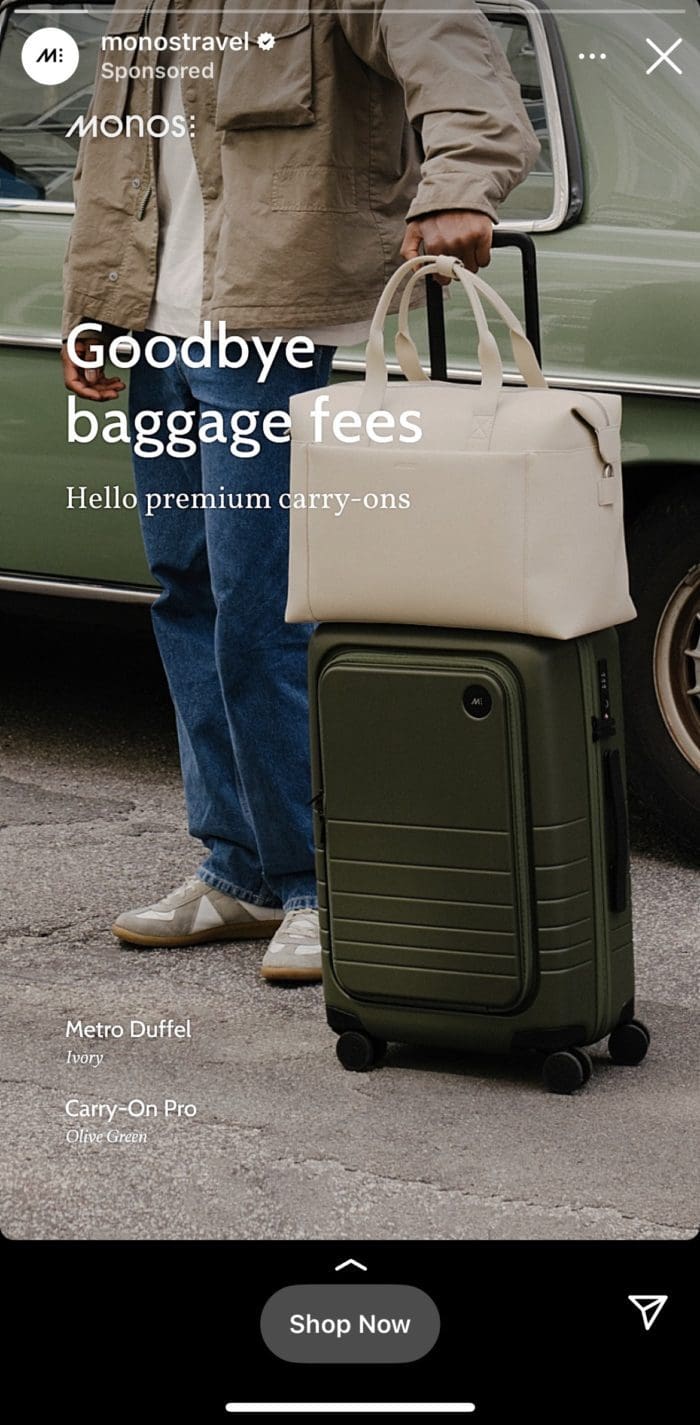
Stories as an ad placement is one of the biggest representations of designing for mobile.
Stories invite audiences to interact with brands through a full-screen immersive environment. Besides its enveloping format, stories are a personalized way for users to share and discover content at a fast pace.
Pro tip: The advantage of a mobile-friendly approach is the ability to leverage the placement’s verticality so that brands can show different characteristics of their products that may not necessarily fit a traditional 1:1 format.
Collection Ads
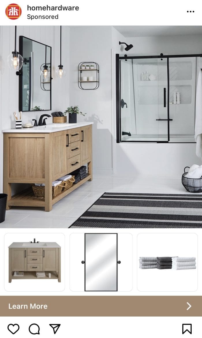
Similar to stories, collection ads are an immersive format enticing users towards a realm of visual mobile shopping. It combines some of the aforementioned creatives such as a captivating cover photo or video with a slideshow of selected physical products.
A great execution of this ad type happens to be a combination of the GIF video format and a carousel-styled slideshow. See the MeUndie’s example below.
By clicking the collection ad, the user is sent to a full-screen Instant Experience where they’re guided throughout a dynamic funnel of various creatives, descriptions, buttons, and links.

2. Tell a story
People are naturally interested in hearing other people’s stories. So why not yours?
Done right, connecting a story to a product will make people remember a brand much more easily and, in turn, chances are that the brand will see more engagement and sales.
Moral of the story is this: in order to stand out in the sea of competing companies, features and benefits will be forgotten. A great story, on the other hand, will always be remembered.
3. Be Authentic
Authentic and real doesn’t have to mean low quality. But how exactly does one translate authenticity to an audience of thousands of different personalities, interests and behaviours?
First, avoid stacked and overly posed shots when filming or shooting. Don’t confuse the user with unnecessary creatives and narrow down on the purpose of the ad and what it’s actually trying to communicate.
Second, avoid posting clickbait, engagement bait and watchbait. Though these tactics may help get views and comments, they severely stunt any sort of brand loyalty growth concerned in a marketing strategy. Misleading users will simply erode trust, decrease leads and their value, make for a poor Facebook experience and overall disrupt any positive benefits of a brand.


4. Put your brand forward
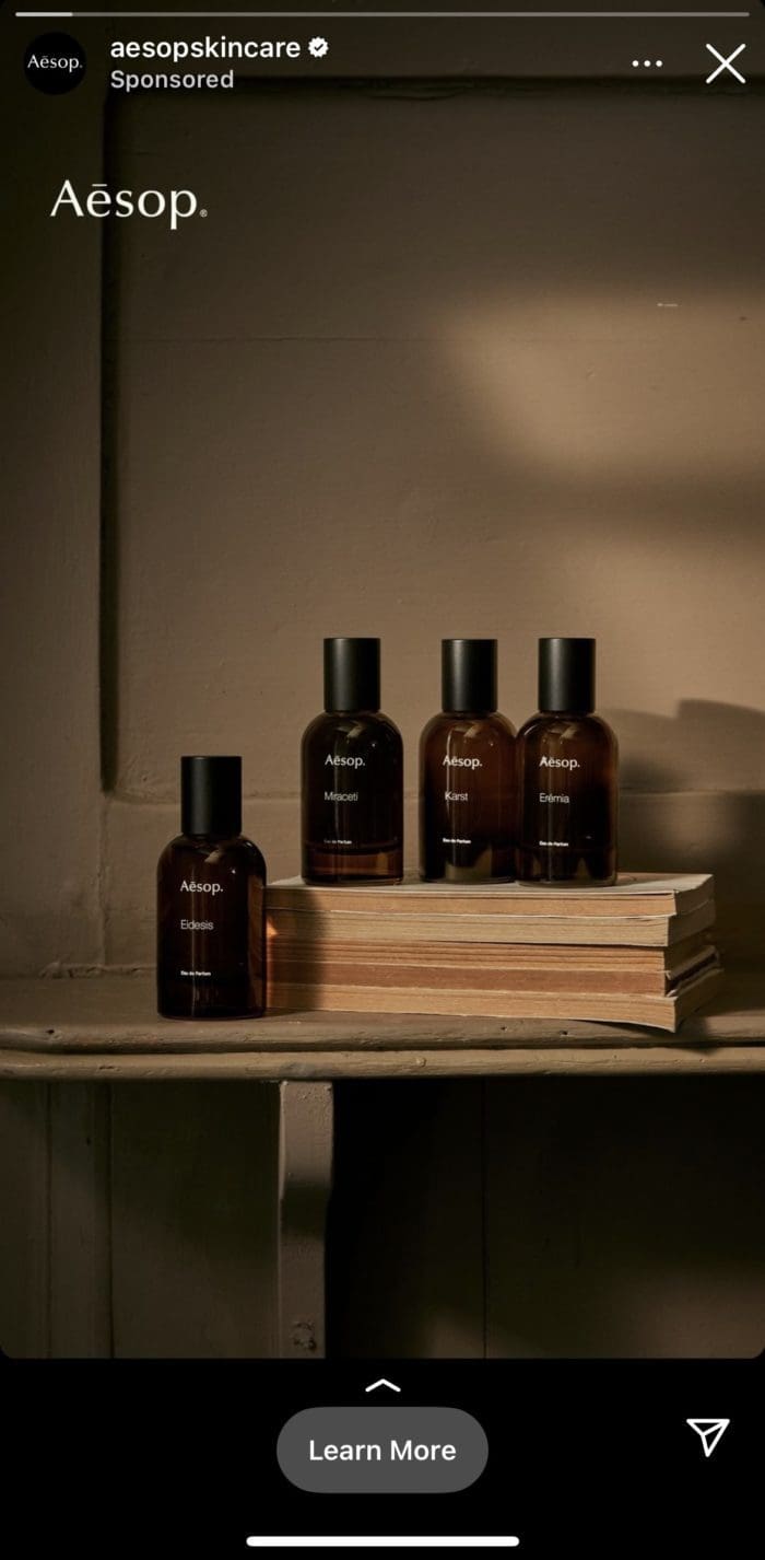
For any brand, crucially for those starting out, it’s essential to practice the inclusion of brand elements within said ad. Not all users read the ad’s caption or the profile that posted it, but remember – brands have 3 seconds to ensure the user knows exactly who is sending the message.
This is possible by implementing brand elements such as logos, slogans, colors, and then some. The result from such small detail changes can make all the difference.
Not only will the user know who’s attempting to engage with them, but this tactic will help create a brand aesthetic. Only once this aesthetic is established could a really well-known brand blur the artistic line.
5. There’s Detail in Design
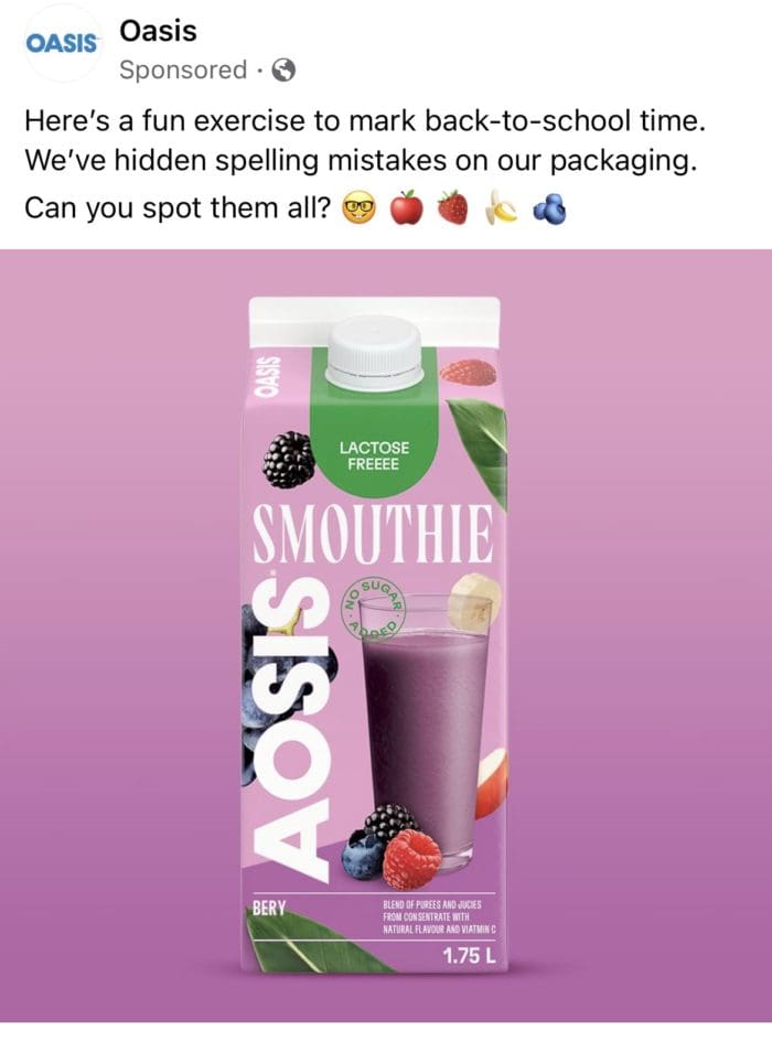
Content creation requires a keen eye for detail:
· Don’t use lengthy texts in the caption, let alone in the actual visual;
· Make sure the headline is short and catchy;
· When relevant, add emojis to the text to break it up;
· Use strong call-to-actions (Shop Now, Add to Basket, Download Now, etc.);
· Don’t forget to be original!
And that’s a wrap on design – apply the above best practices and you’ll be on the right path towards creating standout designs.

Ad Management Best Practices for Facebook and Instagram
Before beginning to run ads, know that Meta’s tool Ads Manager will be both your foundation and your best friend. This all-in-one tool manages where, when, and to whom the ads will be run. Its tracking capabilities also let brands estimate where they’re at in terms of reaching specific and overall marketing goals.
Through this tool, brands can implement the following strongly recommended best practices.
6. Adding Automatic UTM tags to URLs
Short for Urchin Tracking Modules, UTMs are essentially a tracking device that allows marketers to get extremely specific with their traffic source. Knowing what type of content led users to click on a link gives a better sense of what actions to change or take next in the next campaign.
Learn more about the infinite amount of parameters and start testing which combinations will make ad management that much clearer and easier.
7. Implementing Facebook Conversions API
Soon to be mandatory across the Facebook advertising landscape, server-side tool Facebook Conversions API (CAPI) works alongside its predecessor the Pixel in order to fill the gaps seen in tracking, conversion attribution, and overall performance.
The purpose of CAPI is to track what the Pixel couldn’t catch due to a user’s browser settings. It does this by tracking through the server – and not the browser, making for unaffected tracking capabilities and uninterrupted UX.
Read more about the up-and-coming tool in our article Why Marketers Need to Start Integrating Facebook Conversions API.
8. Selecting Automatic Placements As Much As Possible
Facebook will take an ad’s set budget and allocate across multiple placements within the user interface and deliver different ad combinations and creatives based on where they’re most likely to perform.
Facebook will automatically recognize when an ad combination isn’t performing well and will redirect the budget towards those that are. Focus on other areas of your marketing strategy and let the automatic placements do the work for you!
9. Creating Different Campaigns for Prospecting and Remarketing
The goal of prospecting is to identify a new group of potential customers and then connect with them in an attempt to convert them from potential customers to actual customers.
Remarketing, or retargeting, is a way of advertising online that leverages prior interactions with users, users that have taken even minimal action with your brand. Remarketing offers opportunities to those specific users to return to your website or page and complete their conversion or purchase.
10. Avoiding Audience Overlap
Often, target audiences tend to overlap albeit via their interests or demographics which can inevitably lead to an increase in ad expenses, cannibalization among competing ads, and even aggravating your audience.
The best way to overcome these challenges is to add audience exclusions to your campaigns. Depending on the type of overlap and your strategic marketing goals, adding exclusion to certain audience attributes or campaigns makes overlap and easy fix.
11. Adding up to 5 ads per ad set
If an ad set has over 15 ads, Facebook will have a harder time figuring out which ads to optimize unless you’re ready to present an exceptionally high budget.
Having less than 3 ads, on the other hand, doesn’t provide Facebook with enough information to effectively distribute them across the different, nuanced audience segments.
But, 5 ads is the perfect number to test different creatives at once to properly evaluate which have the best chance of working within a specific campaign.
12. Keeping It Simple
When creating ad sets, it is recommended to keep campaign structure clear and simple.
No more than 4 ad sets per campaign is needed as creating more will cause confusion when it comes time to decide which ad sets to optimize moving forward.
13. Checking Your Frequency
Controlling frequency on Facebook is highly encouraged as the platform offers custom frequency caps over specific time intervals. Lack of their control tells Facebook to continue serving ads at a frequency that will attain the lowest cost per result for a given objective.
Experts at Bloom recommend no more than 3 impressions within the last 7 days as the most cost efficient approach to frequency control
14. Mix n’ Match
Stand out by mixing and matching different formats within an ad set. Add carousels, photos and videos to the same set to see what works best for you.
Long Story Short…
The creative design and management processes required to build a strong advertising blueprint comes with much initiative, planning and organization. The best practices laid out before you are just the beginning but will hopefully be the push needed to start or continue to strive for success. Even in an ever changing marketing realm, these tactics should be the pillars to smoother, quicker optimization serving your brand and marketing team for the foreseeable digital future.
Need help with one practice or all of the above? Our experts will be glad to reach out and lend a helpful hand!
Read it first:
Get new articles delivered to your inbox
ABOUT THE AUTHOR
Marie-Joëlle Turgeon
Marie-Joelle works at Bloom, a digital marketing agency, as the Director of Marketing. She's passionate about digital marketing tactics (from social media to web design) for B2B businesses looking to grow online.


Share this: